Portfolio
Digital Designer · HTML Development & Design Systems
Designing and building complete digital brands
since 2011. I help entrepreneurs and small businesses
get a brand and a website that work for them.
Highlights
The man
behind the
work
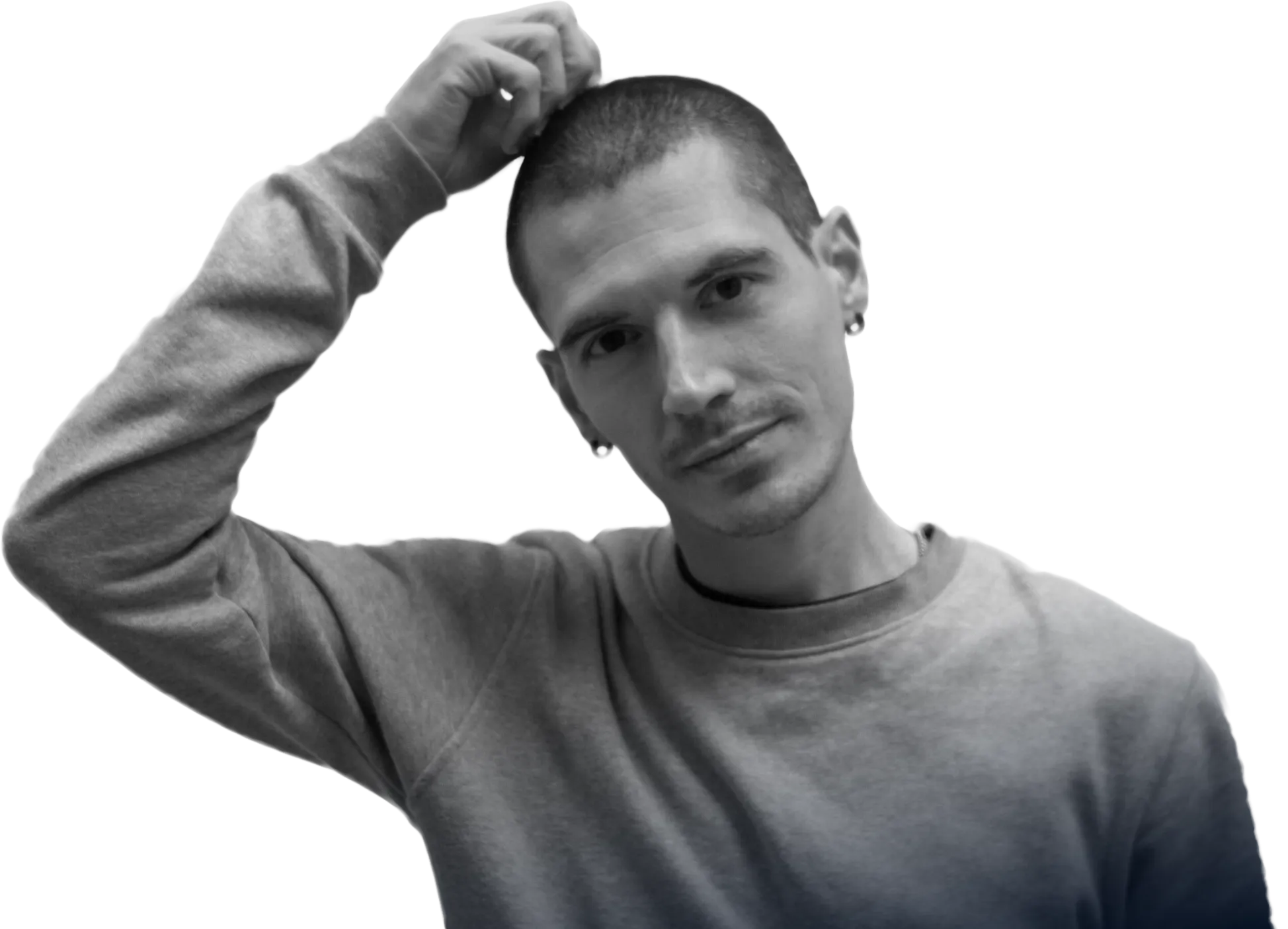
Felix
Nieto

I'm a freelance web designer and developer with over 15 years of experience creating digital brands and taking them all the way to production on the web, with a solid technical base in HTML, CSS, JavaScript and WordPress. I work in a modular, organised way: design systems, consistent brand guidelines and assets built to grow with your business, not to stay stuck in a mockup.
I work with entrepreneurs and small businesses from start to finish, with no middlemen: a single point of contact who understands your business and combines visual judgement with technical skill, so your brand and your website don't just look good, they work and help you win clients.
tape360.org
Project for Cuarto de Tono
(2022)
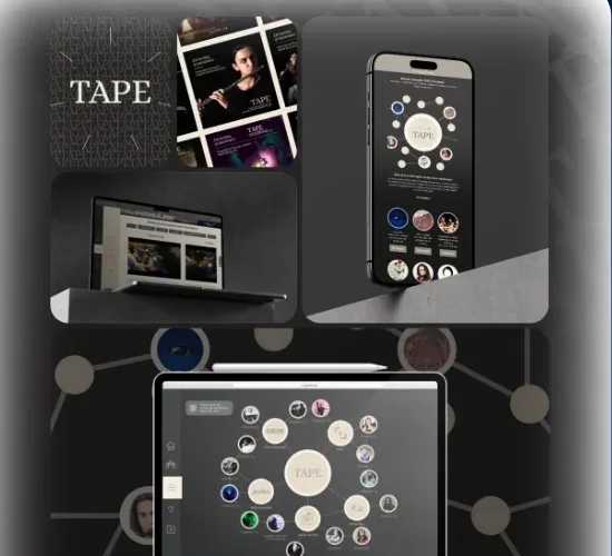
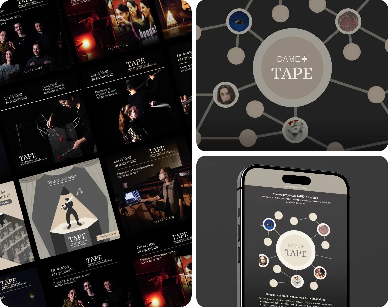
A platform to document in detail the creative processes behind experimental music projects, founded by composer Carolina Cerezo and María del Barrio Mardomingo.
Challenge: Tape took shape over several years of grants. It started as a project catalogue or search tool and ended up as a network of interconnected bubbles, a web of collaborations that had to become the visual architecture of both the website and the campaign.
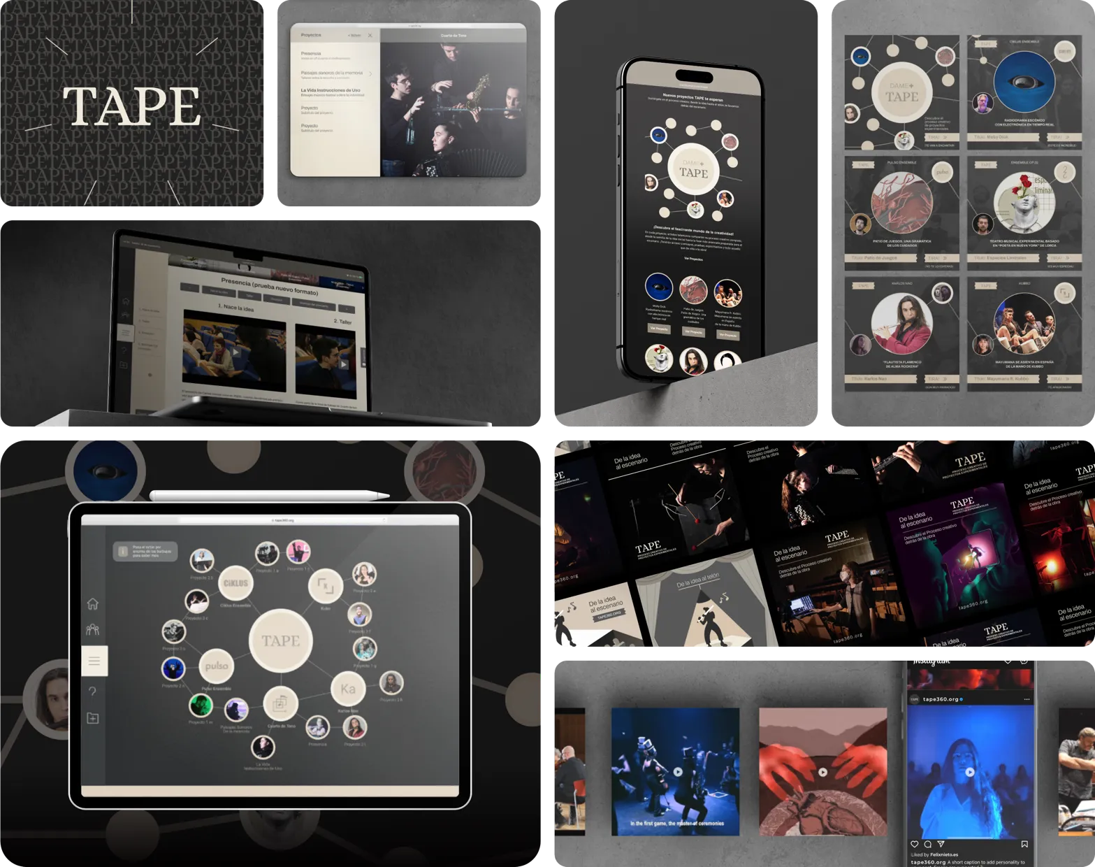
What I did: We used SVG to keep the site lightweight, along with Lottie animations, custom video plugins and a side navigation system. We chose an earthy palette instead of black and white to give it its own personality without stealing the spotlight from the projects. The living bubble design is actually a statistical chart system (Chart.js) modified to display and work with each project's data. For the launch, a social media campaign with ads and videos tailored to the defined audience.
Result: The platform was part of the technical justification for a grant from the Spanish Ministry of Culture, scoring 47 points on the official competitive tender scale (external validation that the project met a professional standard).
Chart.js graphics system and the core concept of the campaign, social media ads and a newsletter for Cuarto de Tono's followers.
Happyweb.es
External collaboration
(January – August 2026)
Complete rebrand of Óscar Rubio's digital marketing agency, where I worked as an external designer while the agency managed its own client portfolio.
Challenge: The previous symbol couldn't carry the weight of an agency that wanted to position itself as a serious partner: it lacked solidity and didn't work across all applications. Óscar wanted a white-label, friendly and colourful brand, without the dark, "tech" look typical of the sector.
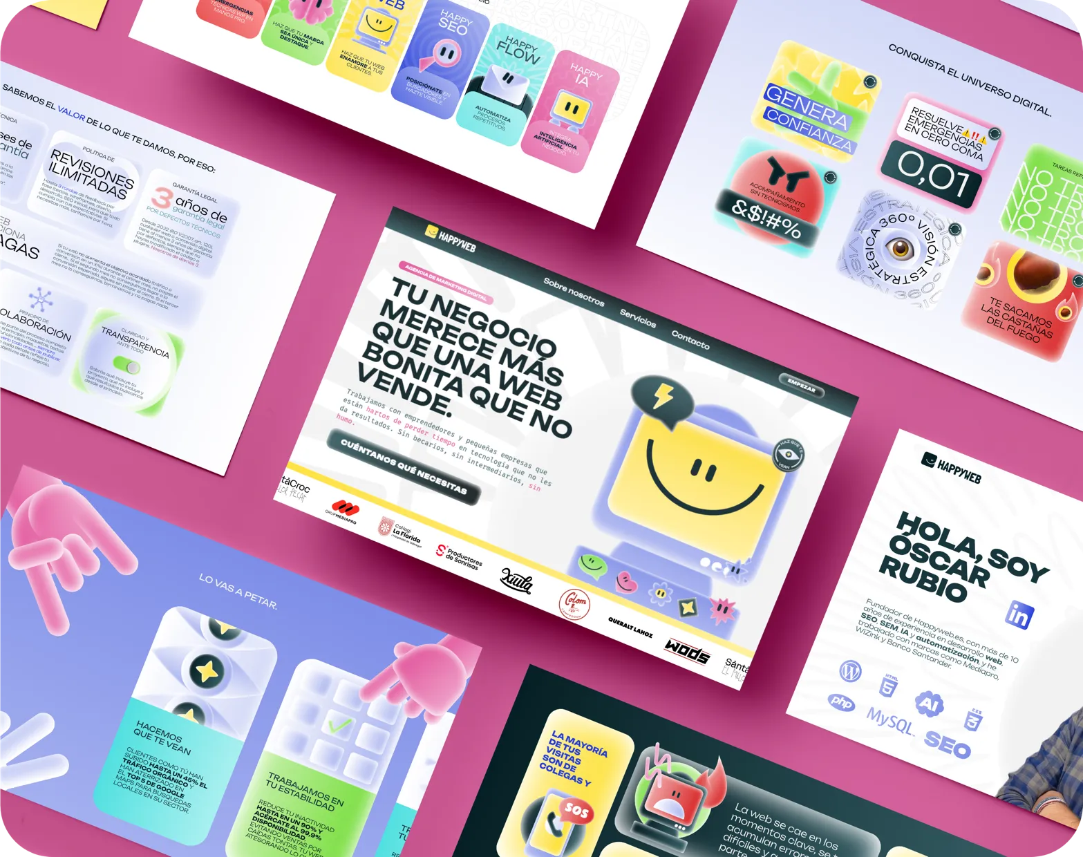
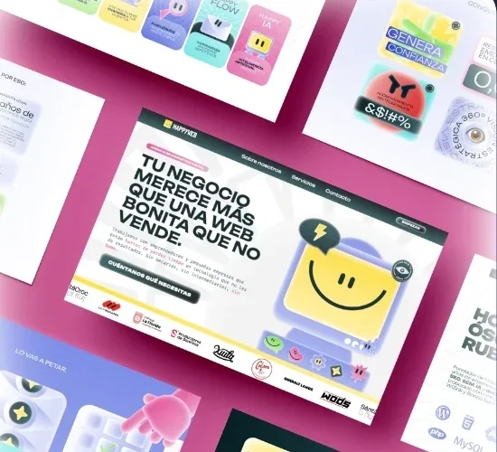
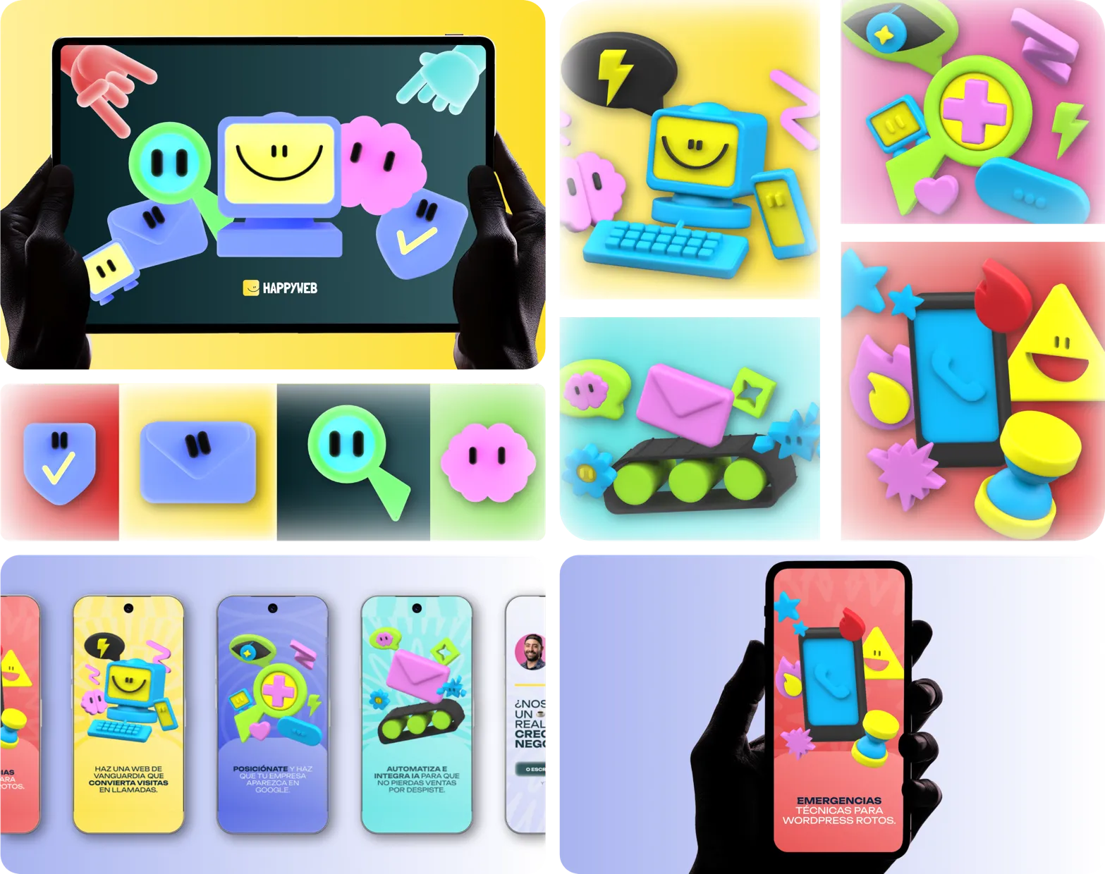
What I did: We worked in phases: purpose, positioning, audience and offer, moodboard and wireframes. We redesigned the symbol and defined a palette with gradients, typography and a visual language of its own: rounded edges, a consistent glow effect and a subtle grain that takes away the digital perfection so typical of design made with today's tools. We built the iconography in two layers: a flat, highly versatile set, and a 3D one (the brand's characters) for key and service pieces, sharing the same palette, lighting and rounded shapes so they combine without breaking consistency. I then designed and built the corporate website in WordPress, fully custom and with no generic templates.
Symbol redesign: flipped to follow the European reading direction, simplified and visually consistent with the rest of the identity.
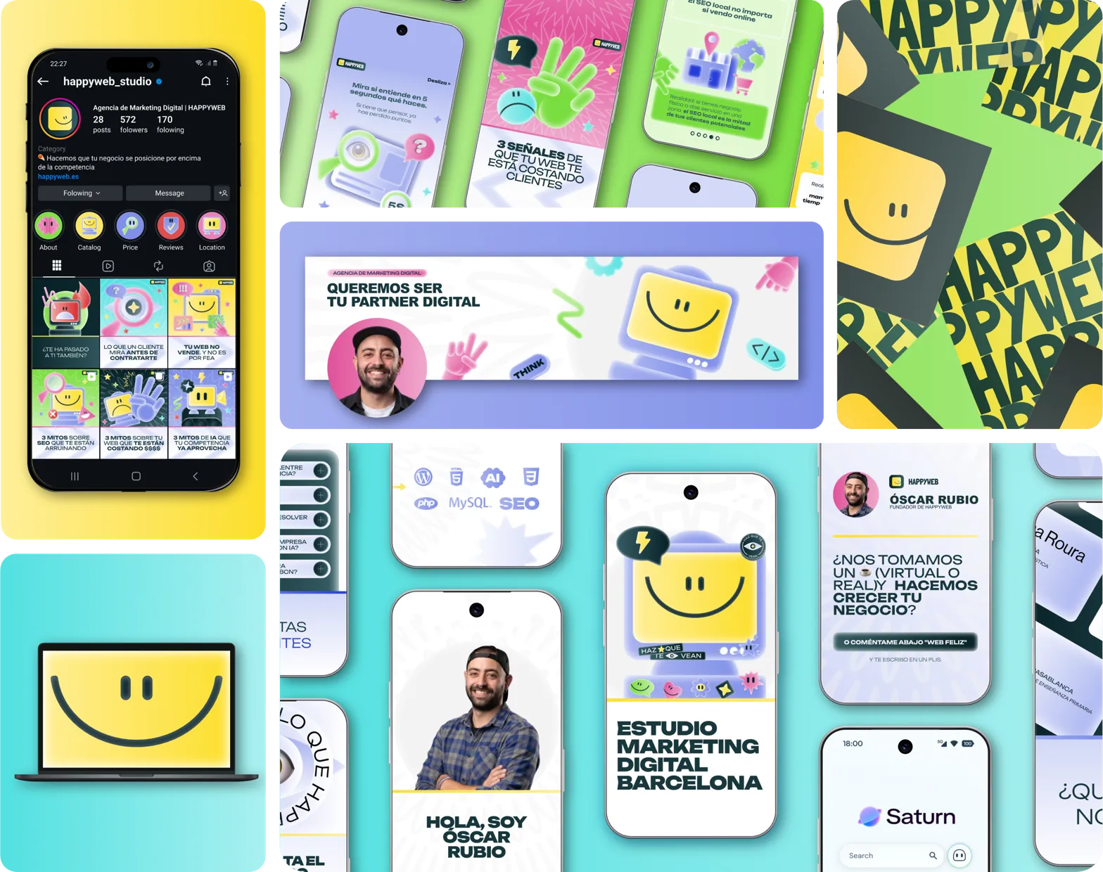
Overall identity applied across different media.
Result: The whole system (logo, palette, typography, flat and 3D iconography, web components) was delivered in Figma and Affinity as a production kit, not a static manual, so the team could reuse and export it without depending on me.
3D illustrations for the brand's main services and for the hero of each service.
Fluture.pro
E-commerce and web app
(2023-2026)
Brand strategy and naming for ergonomic transverse flute accessories with no precedent on the market, created by a music teacher with extensive experience in the field, and met with an unexpectedly positive reception.
Challenge: Validate the offer before designing anything. We confirmed (trying to stay objective) that the problem was shared by teachers and students, and moved from "selling an idea" to "shaping an untapped, receptive market". The client had an app in mind, but we prioritised the physical product (3D-printed pieces that correct posture in real time): it solved the problem with less friction, had more commercial pull and let us validate the market before investing in software.
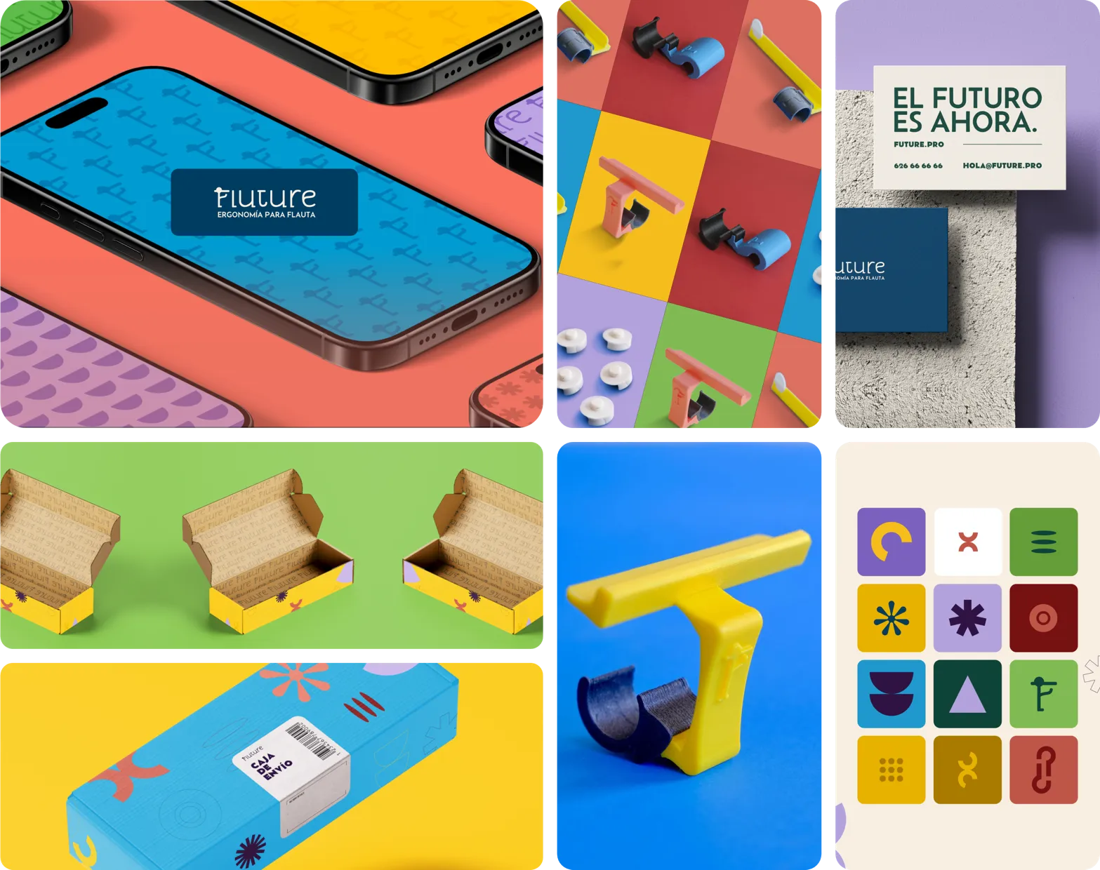
What I did: We built the brand identity, the naming and the online shop (with product photography), integrated into an ecosystem with a presence on social media, industry fairs and specialised physical stores. The app is on hold; resources have gone into raising awareness of the accessories.
Result: After an unexpectedly positive reception, the brand is now present in schools and music centres in Spain, Italy, Portugal, Mexico and the United States.
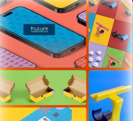
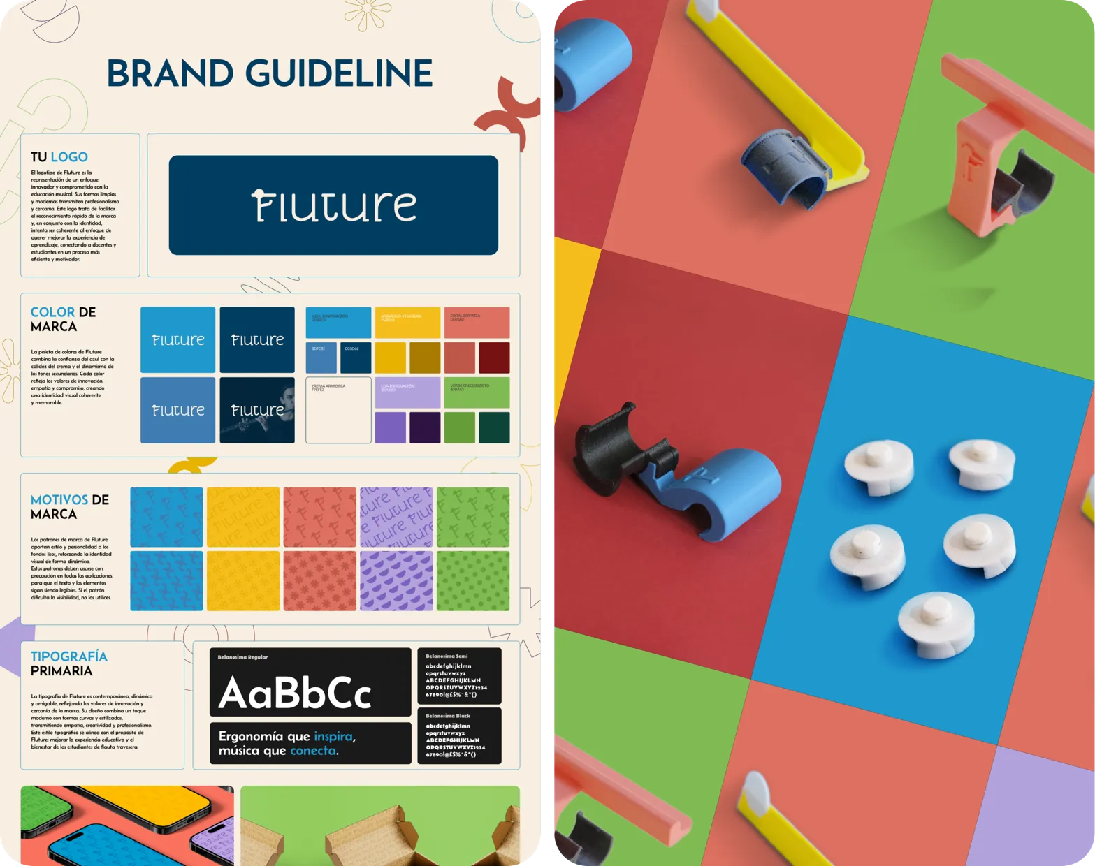
Left: brand panel summarising the guidelines in a few key elements to make them easy to use.
Right: Fluture accessories that help improve posture and make learning easier at every level.
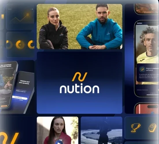
Nution.es
Long-term project
(2021-2025)
First brand identity from launch and a full rebrand three years later, when the business went from "solo professional" to a brand ready to scale.
Challenge: Nution wasn't just another nutrition service: Mario and Sara, who play and love sport, wanted to bring nutrition into action. They didn't just need something visual, but a useful system and a clear positioning (results without restrictive diets) aimed at a well-defined client.
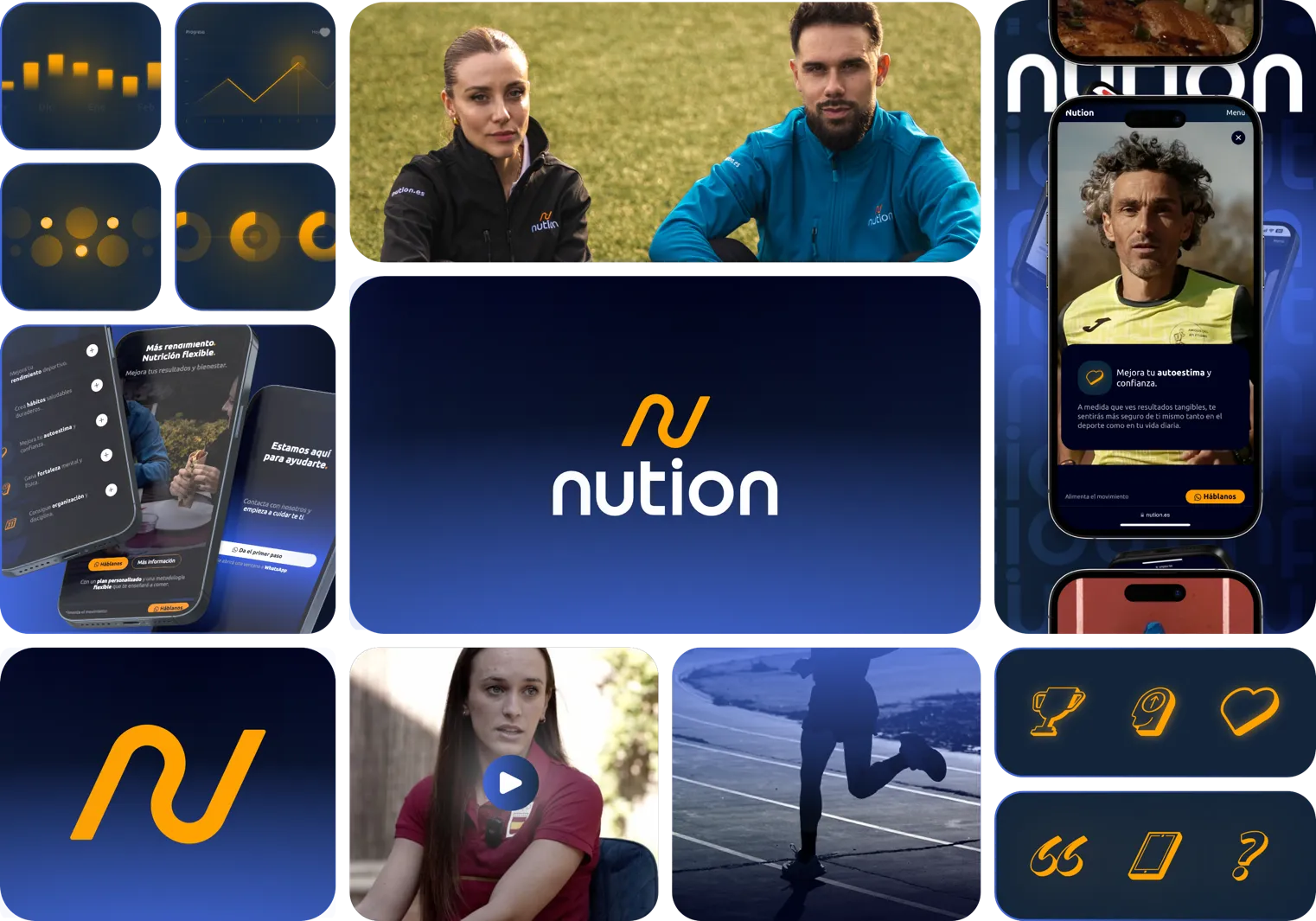
What I did: We developed the brand strategy over 6 meetings (personality, client and offer), then moodboards and wireframes to set the direction. In the rebrand we kept the symbol intact for continuity and rethought everything else with a more digital look: darker gradients, graphics with floating sparkles, animations and a website with the usability of a mobile app. The system (palette, typography, iconography, content tables and video guide) covers internal documents, web, social media, ads and professional third-party shoots, and includes a user-level recipe template so Mario and Sara can easily create their own.
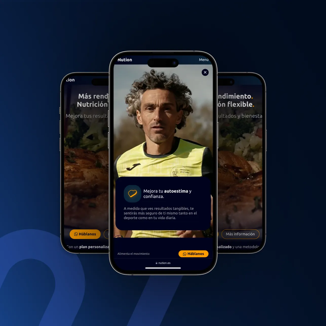
Website screenshots with Jesús España Cobo.
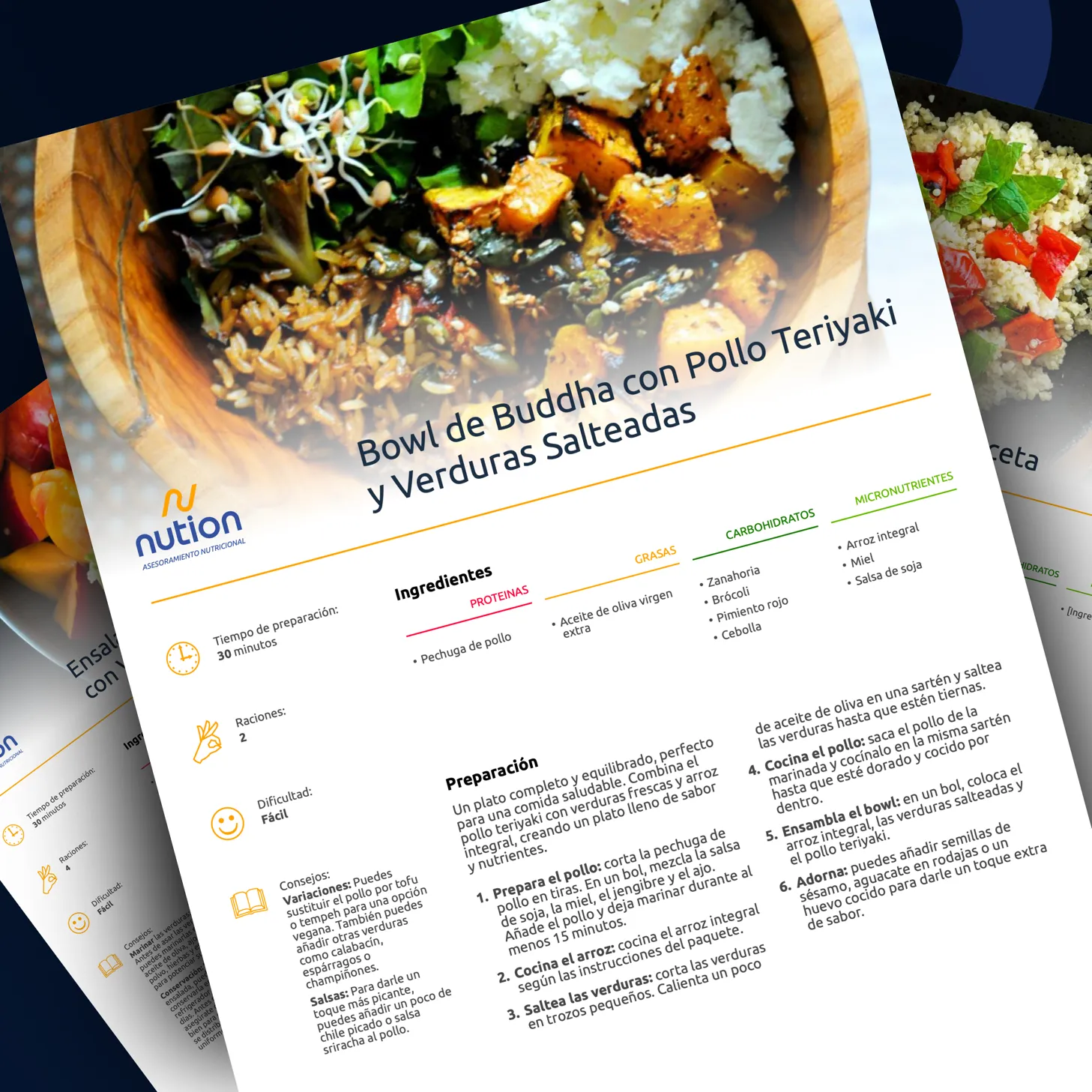
User-level recipe template so Mario and Sara could easily create their own recipes.
Result: Nution became more "grown-up" and consistent, with a system that lets it keep growing and building its own universe. That concept has allowed them to work with some of today's top Olympic athletes: Jesús España Cobo (European champion, Olympian at Beijing 2008 and Rio 2016), Blanca Hervás Rodríguez (Olympian at Paris 2024 and gold medallist in Guangzhou 2025) and Esther Navero (Olympian at Paris 2024, Spanish national champion).
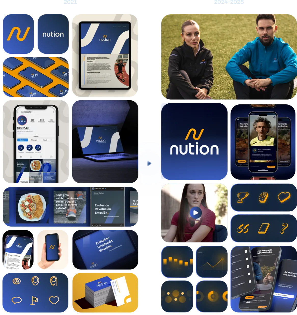
Before and after the Nution rebrand. 2021-2024.
Abastores.com
B2B agricultural platform
(NOV 2020 – MAY 2023)
Spain's first platform for buying and selling cereal with no middlemen, built on transparency and fair trade; it now handles more than 120 million kilos of cereal sold digitally, with over 600 registered farmers.
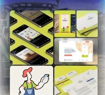
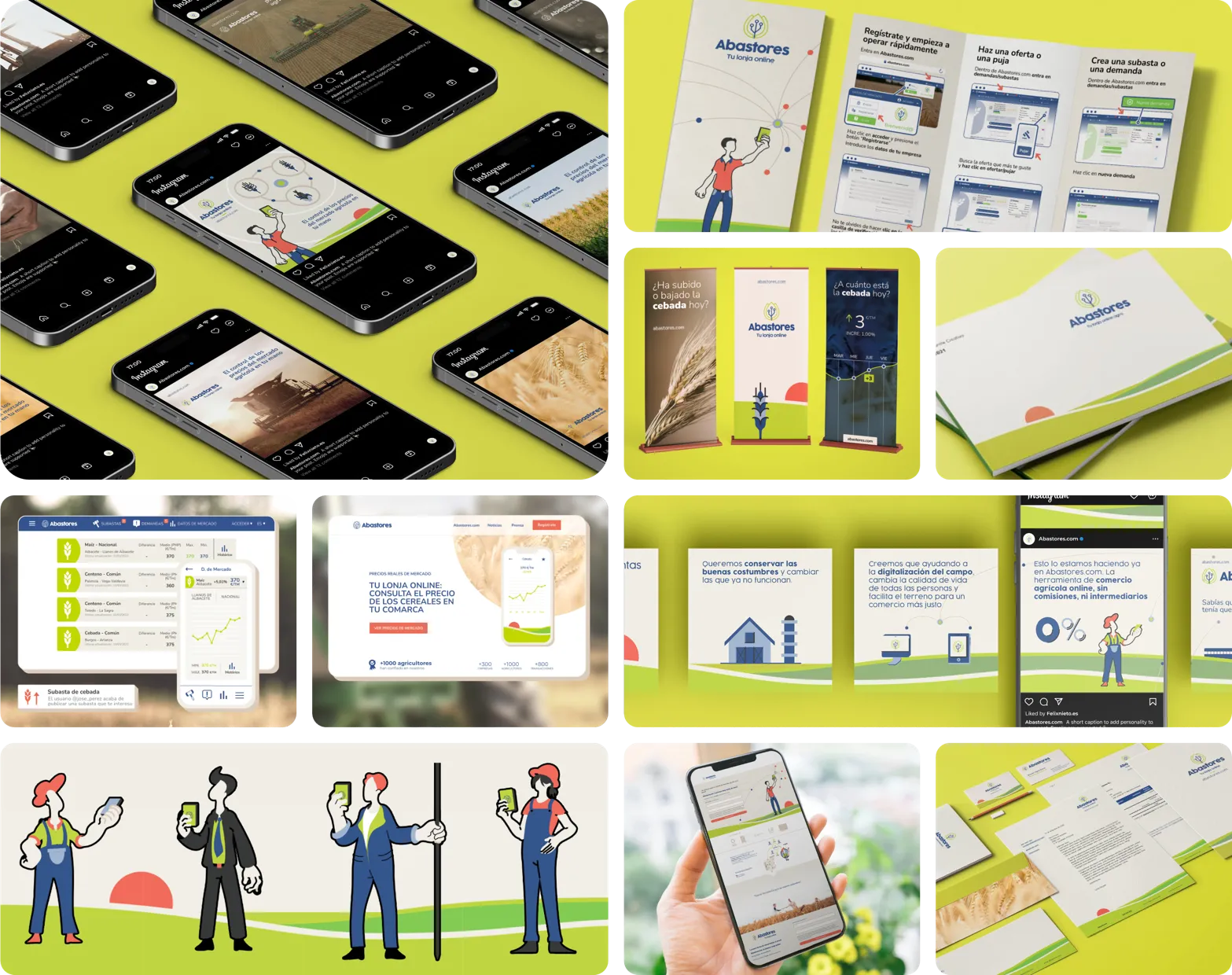
Challenge: Adapt the identity system to a sector with very different profiles (barley brokers, farmers, warehouse managers). We expanded it with a series of characters representing that diversity of roles and genders.
What I did: I worked for several months with the team on the brand system, the investor deck and the one-page site. We also designed a highly segmented social media campaign.
Result: The materials helped close their next investment round; the campaign achieved leads for less than €1, to the point that it had to be broadened.
Natalia-g-iglesias.com
Project for a composer
(2024 – 2025)
Natalia G. Iglesias is a contemporary classical composer, a graduate in Music Education and a PhD candidate in music research, with works premiered in Spain and Germany by renowned ensembles and soloists, and commissions from institutions such as the CNDM and the SGAE Foundation.
Challenge: Help her win commissions from institutions and programmes that support composers like her.
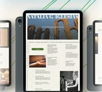
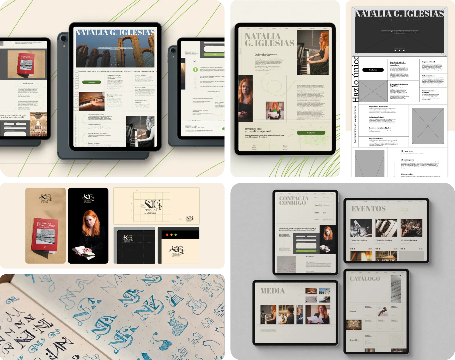
What I did: We created her symbol and brand system, and a website with an analogue, graphic feel (subtle grain, green details reminiscent of pencil notes). We built it with grid and flexbox in HTML, and it includes a WordPress blog where she publishes her poetry.
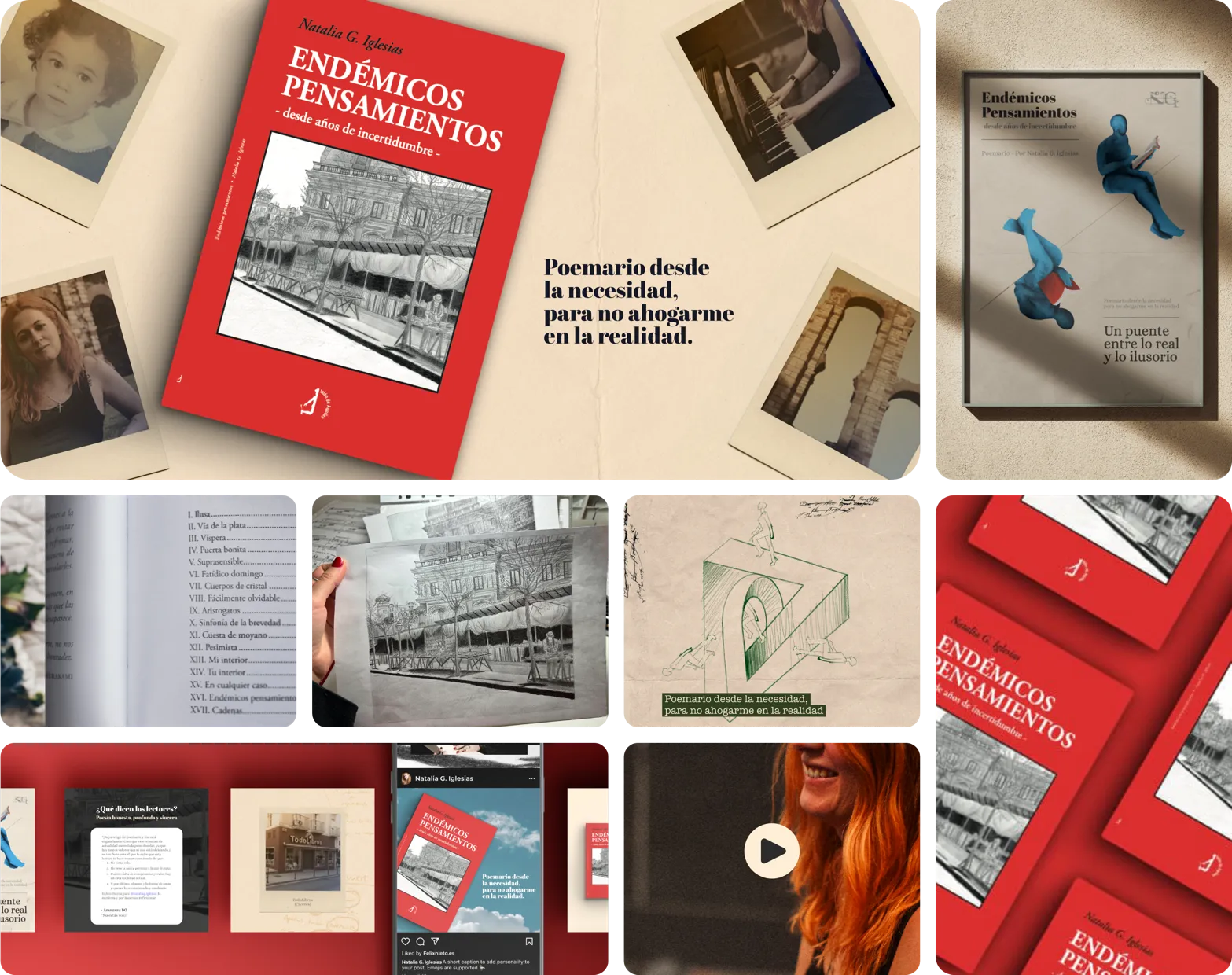
Poetry book "Endémicos pensamientos"
Book launch
(03/2024 – 07/2024)
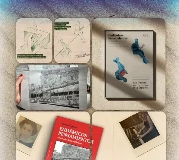
Web design, graphics and launch campaign for composer Natalia G. Iglesias's first poetry book, centred on ghosting: a story of absence and farewell told through poetry.
Challenge: Find a brand concept that could hold a tone that was both intimate and ambiguous, true to writing that mixes the direct with the abstract.
What I did: Poster, advertising pieces and a promotional website, treated as a project separate from the rest of Natalia's identity, with its own visual voice.
Result: The goal was to pass the publisher's trial to keep producing the book and sell 100 copies in 3 months; we did it, though not without effort.
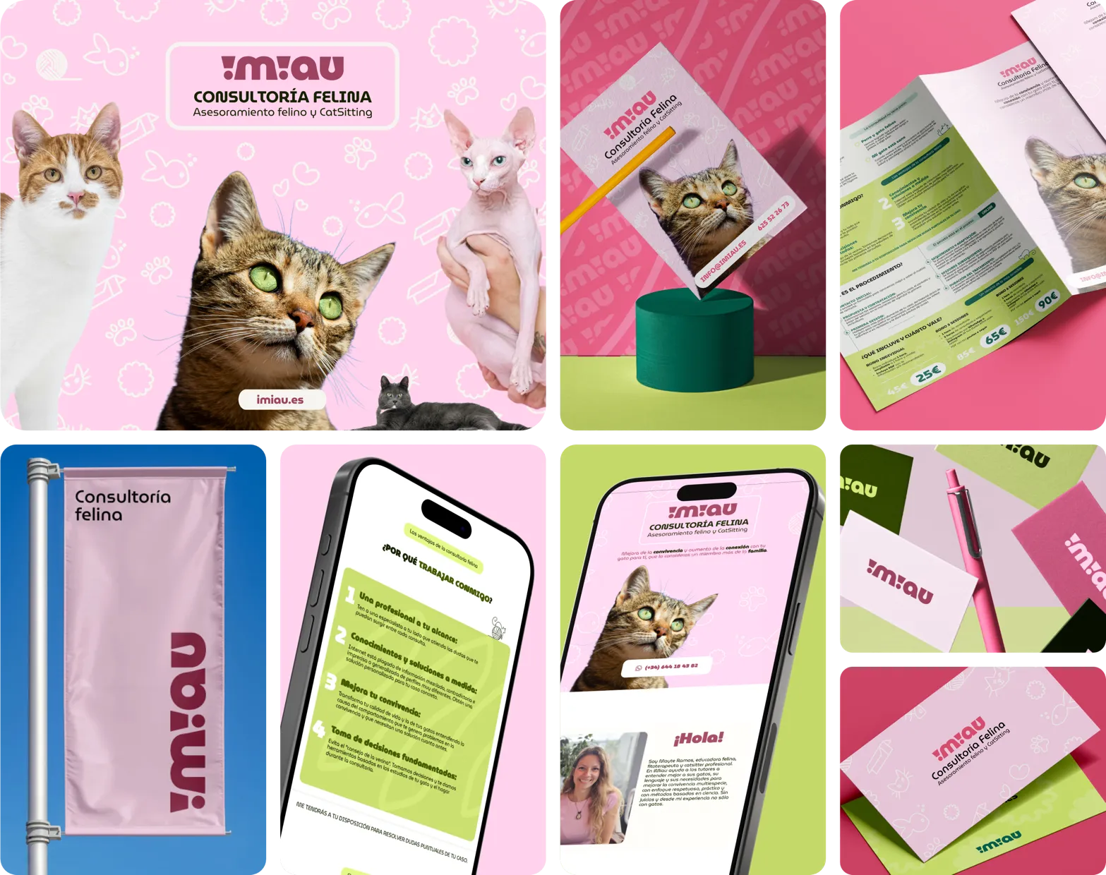
iMiau.es
Cat behaviour consultancy
(2024 – 2025)
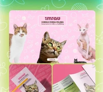
iMiau is the cat consultancy of Mayte Ramos, a bond-based educator, phytotherapist and professional cat sitter who helps multi-species families better understand their cats and live together more happily at home.
Challenge: Convey the care and affection she puts into every case. The original brief was a leaflet; we ended up building the complete brand on the tightest possible budget.
What I did: I defined a pastel palette (pink and green) that blends tenderness and warmth, MuseoModerno as the typeface to balance friendliness with professionalism, and a system of doodles representing the emotional world (cats' worries and mischief). The system was carried consistently through to the website.
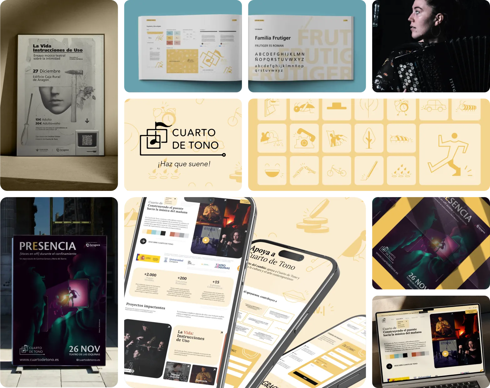
Cuartodetono.es
Music ensemble
(2020 – 2025)
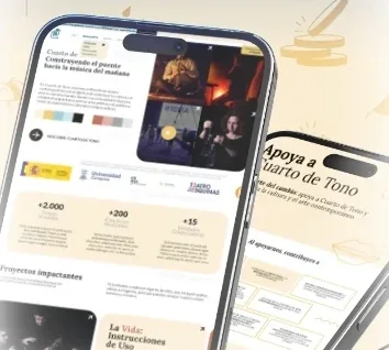
360º music shows for culturally curious audiences, aiming to share classical music heritage in an accessible way, without the solemnity it is sometimes presented with.
What I did: It was the first project to bet on me when I started out as a freelancer, and together we developed the complete identity system: symbol, posters for different events, several websites and campaigns.
Result: The symbol even appeared on the Zaragoza news.
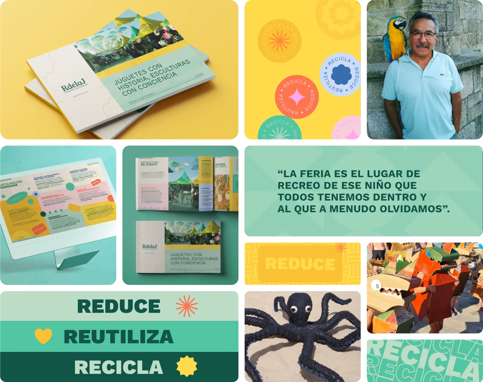
RdelaJ
Brand for an event organiser
(SEP 2023 - NOV 2023)
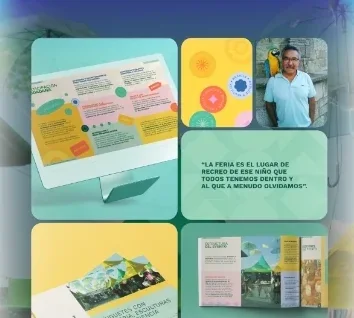
René de la Jara Pérez, event organiser and sculptor, has spent more than 25 years helping town councils all over Spain put on multicultural fairs of entertainment, culture and environmental awareness.
Challenge: Give a professional image to a project with a long track record but no established visual identity.
What I did: The original brief was a sales leaflet, but along the way we also defined the brand's identity and complete look, and ended up creating a digital PDF presentation as well.
Result: A piece that condenses 25 years of experience and that René can take to every new town.
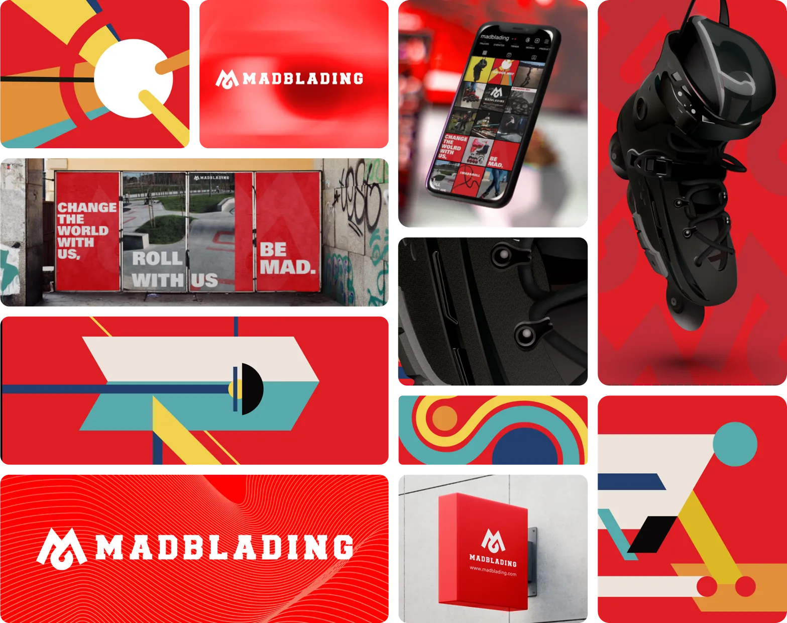
Madblading
Skate shop and school
(AUG 2017 - APR 2018)
Madblading was born in 2015 when a group of professional aggressive and freeskate skaters started teaching beginner classes, growing into a shop and school specialising in Flying Eagle skates.
Challenge: A brand strong enough to convince an investor to open a physical shop.
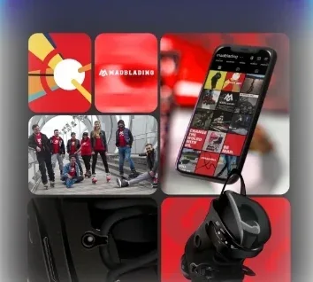
What I did: Brand identity and system, design of the shop's physical space (stands included) and a series of original illustrations, one of which was printed at large scale in the shop itself.
Result: The brand system helped secure a grant and the project's first investor; with them, Madblading was able to open its own shop and school in Pinto (Madrid).
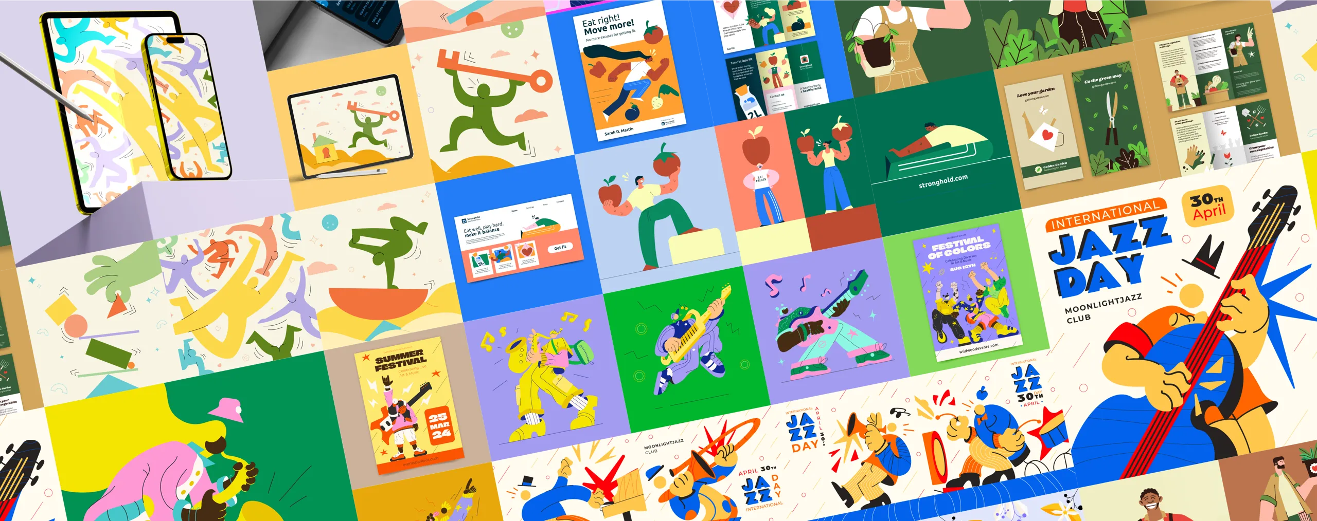
Illustration/Freepik
Illustration under art direction, at a professional scale
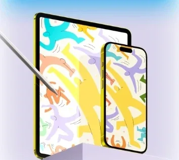
During my time at Freepik I worked under art direction and style guides defined by the team, producing illustration for a platform used by millions of people. It demanded versatility across styles, consistency with other people's briefs and a steady production pace: the same discipline I bring today to every brand project.
Thank you
Digital Designer · HTML Development & Design Systems